Meet Sarah Fairchild, known for her vivid botanical compositions, transforming ordinary flowers and plants into luminous, larger-than-life works that celebrate the beauty and resilience of the natural world. Inspired by her rural upbringing and guided by the concept of Anima Mundi—the belief that a shared spirit exists throughout nature—Fairchild invites viewers to slow down, look more closely, and discover the extraordinary within the familiar. We spoke with Fairchild about the inspiration and process behind her two new Haystack editions.
Your two new editions Queen Anne’s Lace II and Chicory II feel like a continuation of your work, but with something new at play. What was different about creating these particular pieces?
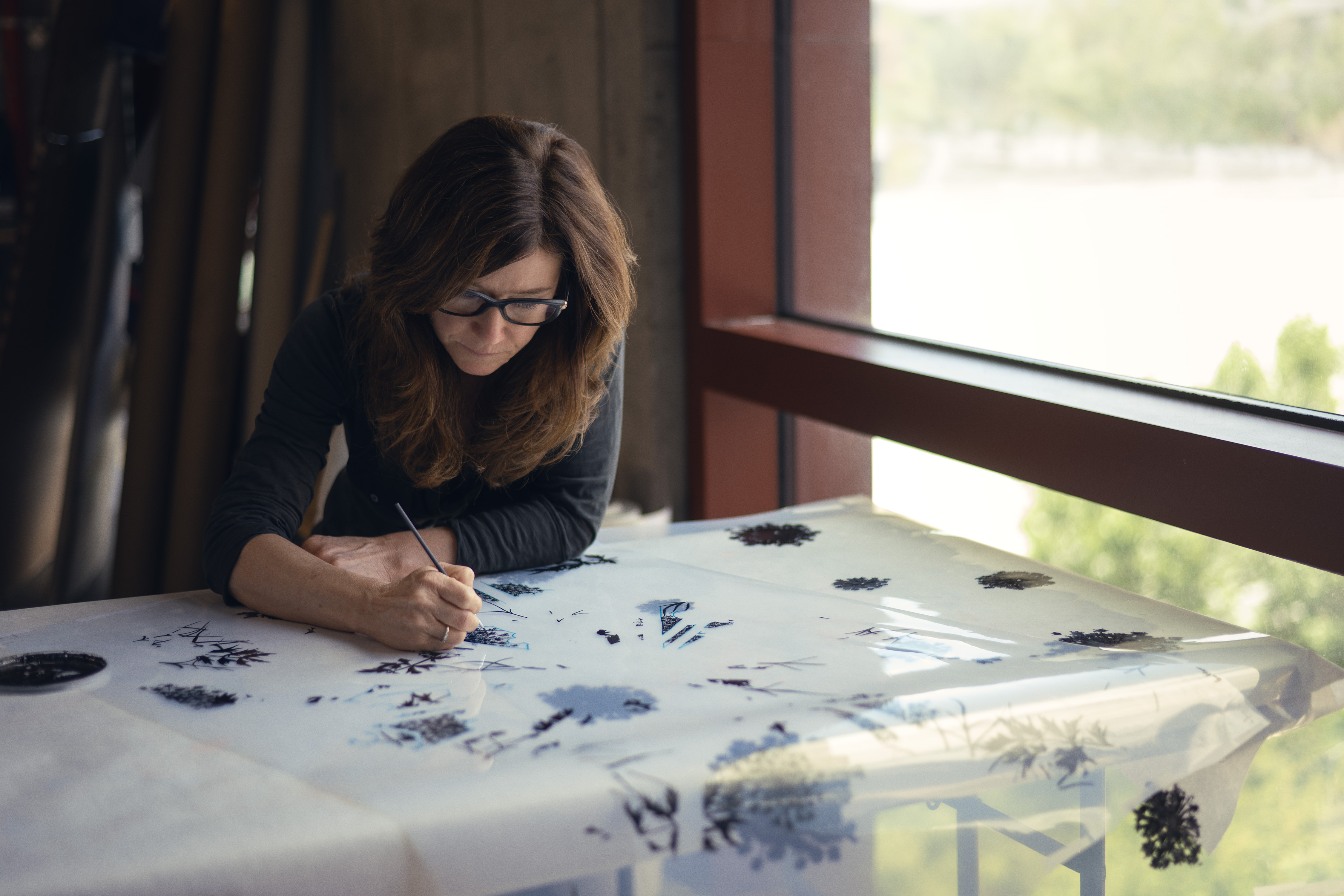
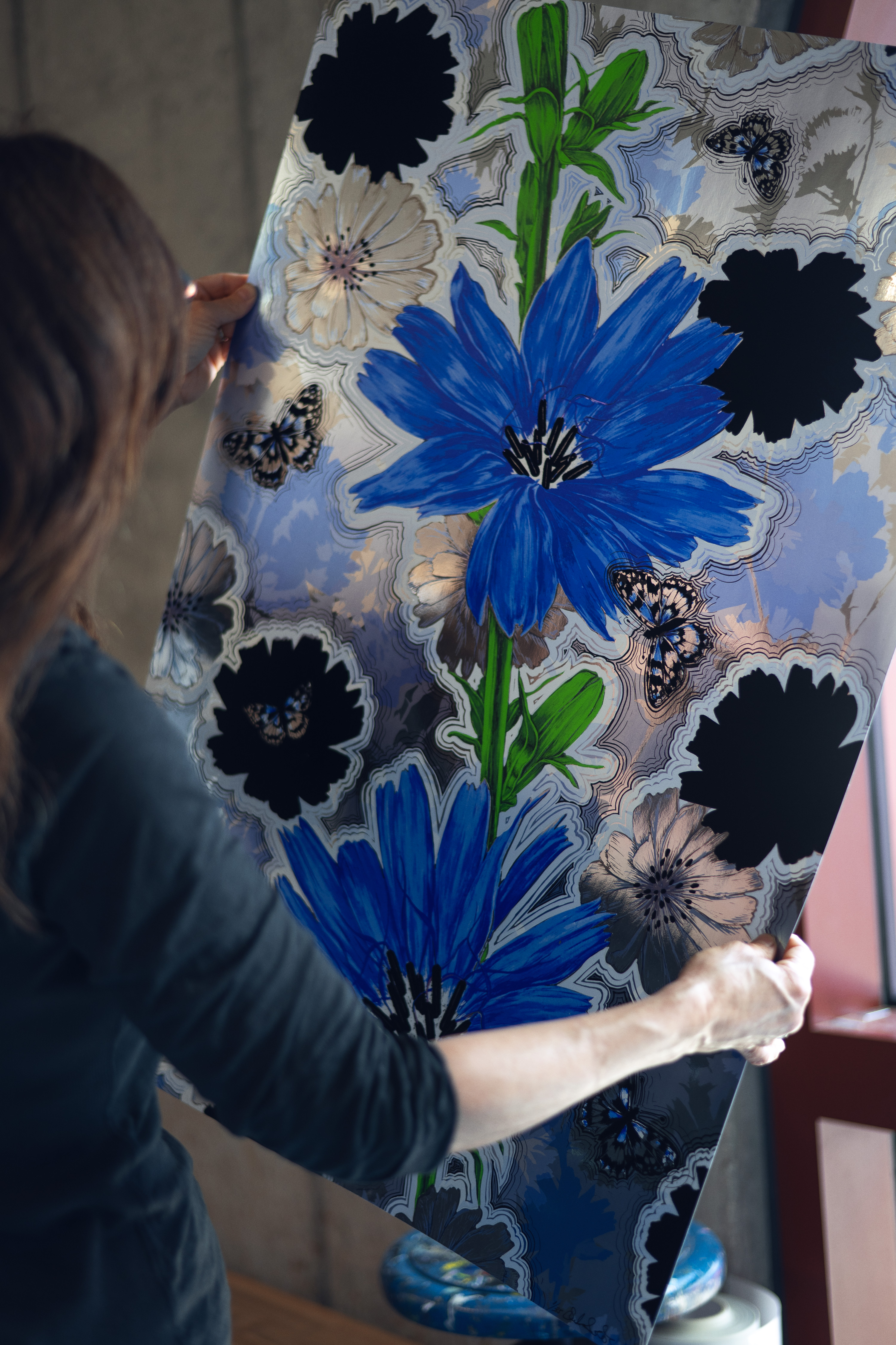
Nature is the thread running through everything I make. I work with the idea of Anima Mundi—a spirit within nature that connects all living things. With these prints, I pushed the materiality and process further than I have with my other editions, working on metallic paper and hand-flocking each print myself, one at a time. I usually work with hand-drawn films. Even with the digital films I’ve used, I paint into them, scratch out sections, and accentuate a line. It’s about mark-making, not reproduction. That direct process—scratching, painting, layering by hand—is what distinguishes the work from a standard edition.
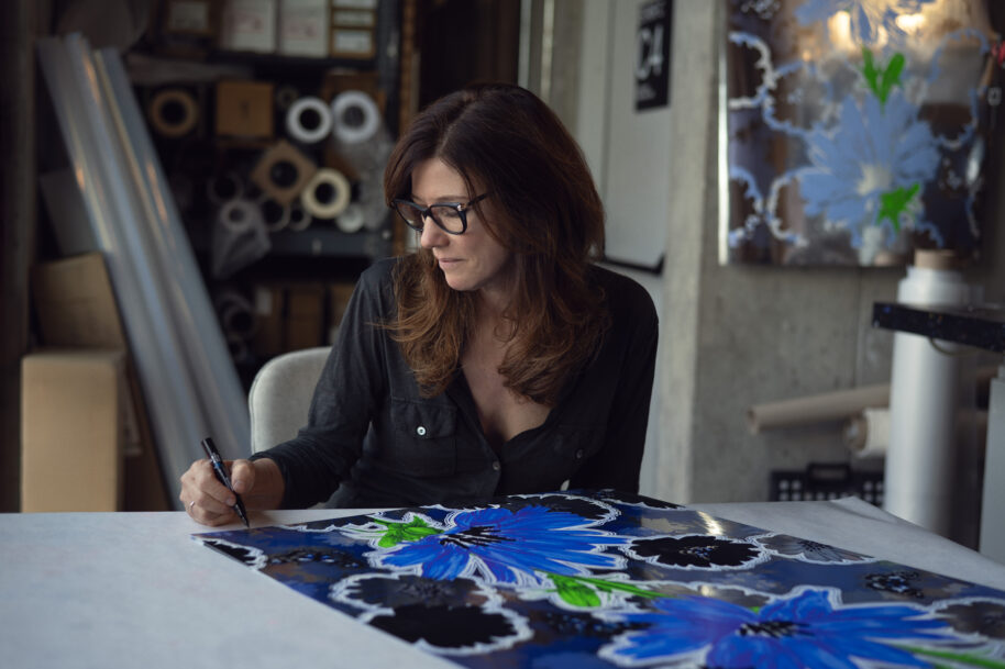
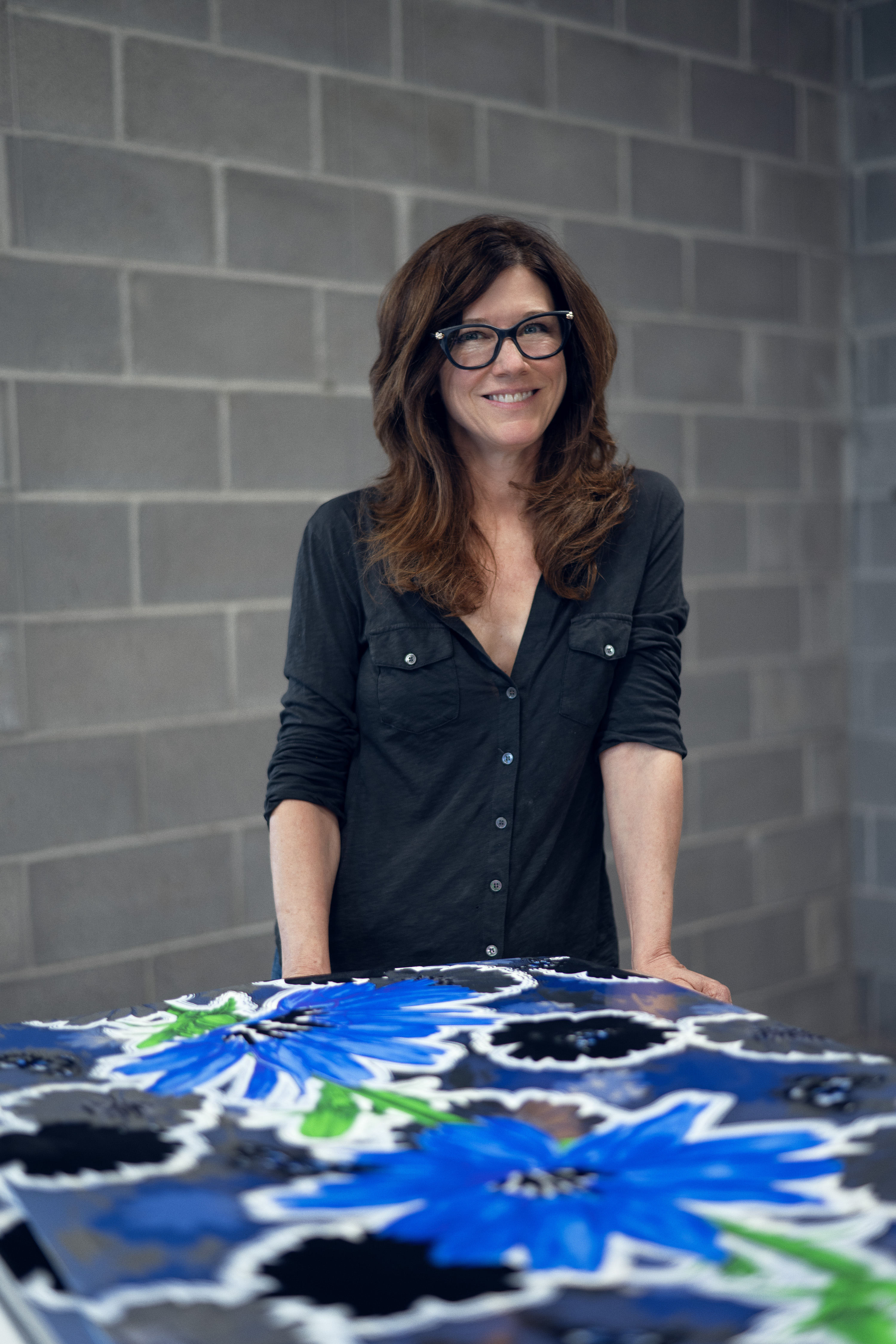
 Sarah Fairchild at Powerhouse Arts. Photography by Nir Arieli
For these editions, I wanted a more direct connection to my studio practice, where I use silkscreen as a painting tool. Working on foiled silver paper, the process became a response to the surface rather than a strictly methodical, preplanned approach. The surface holds the mirrored metallic against dark velvet flocking and bright color, and the works begin to behave more like paintings than prints.
Your color palette is so bold and unexpected—colors one might not necessarily associate with produce or plants. How do you decide on color? What are you hoping the color choices do for the viewer?
Color is intuitive for me—a hunch, an exploration, something I feel compelled to do. Sometimes I start with a flower’s natural color and push it further, exaggerating what’s already there. Other times it’s completely abstract, with no tie to the actual plant at all. Either way, the goal is the same: to pull the form out of strict representation so it can be appreciated on its own terms. I want viewers to feel a kind of childlike wonder, that moment where something familiar becomes strange and a little extraordinary again.
You mentioned wallpaper as inspiration for the work. What initially drew you to choose these images for the edition?
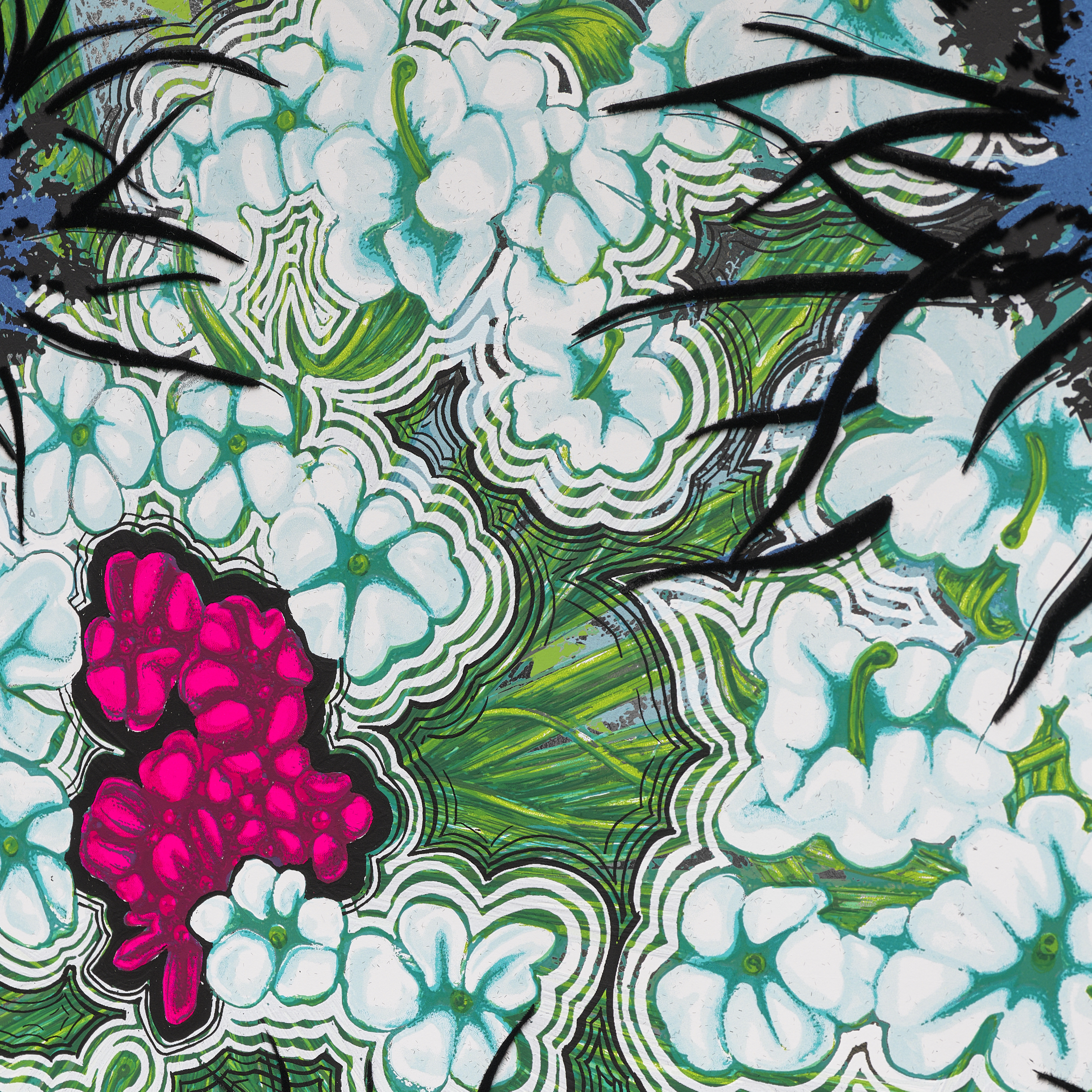
Wallpaper has been a backdrop to my life since childhood, in a home where the curtains matched the pillows and the pillows matched the walls. In nature, a flower never exists in isolation—it’s surrounded by its own kind, with other weeds and wildflowers crowding in. I take that kind of visual abundance and flatten it into the work. The background is built from the central form itself—broken into parts: buds, leaves, different stages of growth, silhouetted and layered. The form appears both as focal point and background. This is a concept I’ve also used in my wall installations. These prints connect directly to my Flower Remedies series. I see nature as medicine. Each work becomes a way to return to a memory, a person, or a place, and through observation and making, I get to choose how I hold it.
Do the flowers mean anything to you?
Chicory connects to my grandfather. He spent years pulling it by hand from the fields he worked—he hated it, so as a child I thought I had to hate it too. But I never actually stopped thinking it was beautiful. Coming back to that flower and allowing myself to love it again on my own terms taught me something about individuation—holding a point of view that is truly mine. I also believe plants carry their own energy, their own presence (Anima Mundi), and that’s part of what I’m trying to bring into the work.
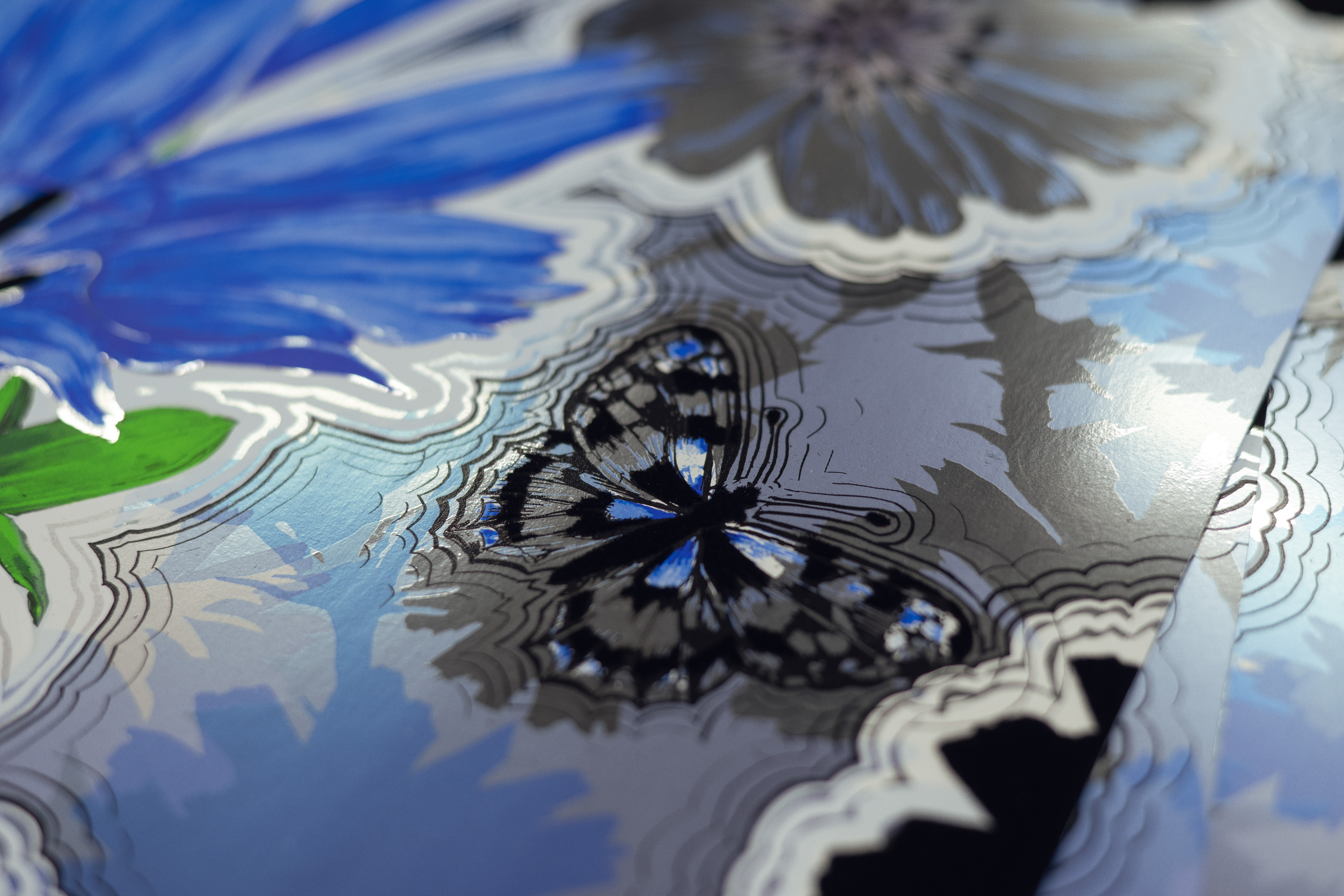
Queen Anne’s Lace grows along highways too—just as resilient, but lacy and delicate, almost contradictory in how tough it actually is. It stands tall even after a hard rain, never drooping. Honestly, I’m never entirely sure if I’m looking at Queen Anne’s Lace or its close relative, wild carrot. Some have a tiny dark purple cluster at the center, easy to miss unless you’re really looking. In the print, I made that center hot pink—something small and easily overlooked, now impossible to ignore.
 Detail of Chicory II. Photography by Nir Arieli
These editions will end up on walls—in spaces that are lived in. What do you hope someone feels each time they walk past one of these prints?
My work never sits still on a wall. It’s activated by the viewer’s proximity, the time of day, the quality of light in the room—always shifting, always asking to be seen again. I want to take the ordinary and make it extraordinary—a bit of disco, a bit of country road. I’m drawn to plants most people walk past without noticing: dandelions, clover, roadside weeds—the overlooked forms entire ecosystems depend on. I want people to notice them, and maybe even protect them.
Interested in adding Fairchild’s editions to your collection? Click here to learn more.