Swiss painter Pia Fries studied sculpture in Lucerne before studying under Gerhard Richter in Düsseldorf. Her paintings are known for thick, sculptural layers of oil paint combined with silkscreened images, where color takes on body and weight. We spoke with Pia about color as a material substance, how her Haystack editions were built in layers, her collaboration with master printmaker Keigo Takahashi and the meaning behind the title Tabor.
Your paintings give color real body and weight. How do you think about color and the material substance of paint, and how does that show up in a print?
As a painter, I am in the service of color. I take up the material substance of paint and work just as much with its fleeting character. My paintings show the body and weight of the paint: a shaped, sculptural relief. At the same time, they capture the fluid, flowing runs of color and their movements. In looking at the paintings, the eye feels its way over the heights and depths and senses the difference between the optical and the haptic.
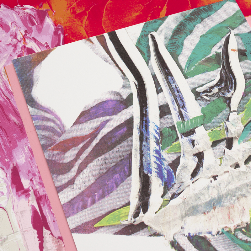 Pia Fries, detail of Tabor A, Haystack edition
How are Tabor A and Tabor B built, and what do you mean by “a picture within a picture”?
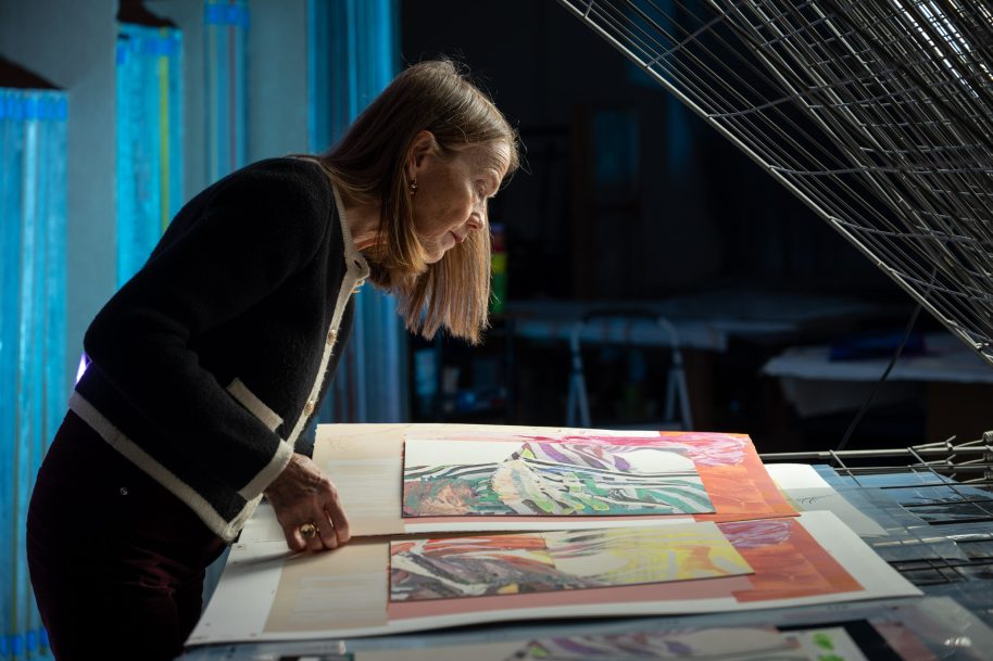
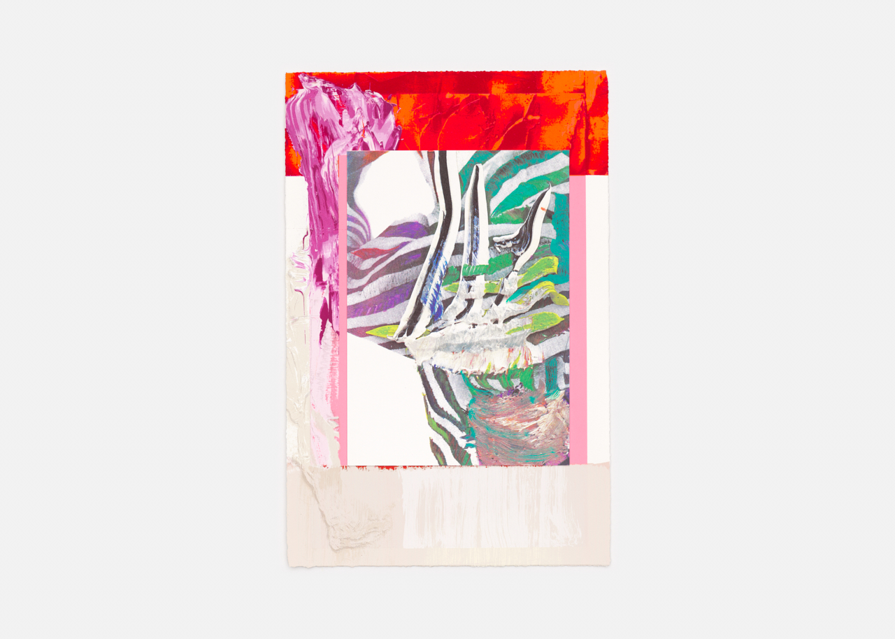
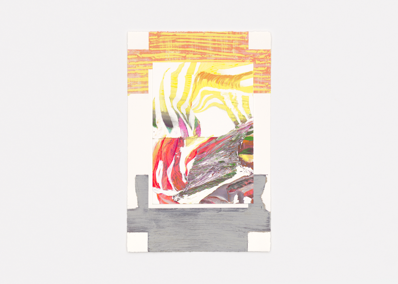
Tabor A and Tabor B consist of two layers laid one over the other. The collage uses high-quality museum paper. Each layer is made with a different technical process. The lower layer shows areas of color structured by brush or palette knife. On the layer above, sculptural, impasto strands of paint are printed photomechanically with halftone dots. Over this, I painted delicately colored brush drawings by hand on film, which Keigo printed.
Tabor A and Tabor B show color as a shaped, structured substance that unfolds its own autonomous power in interplay with the free painterly gesture. It is “a picture within a picture”: the one shows and carries the other.
How did master printmaker Keigo Takahashi translate the robust passages and fine gradients of your paintings into print?
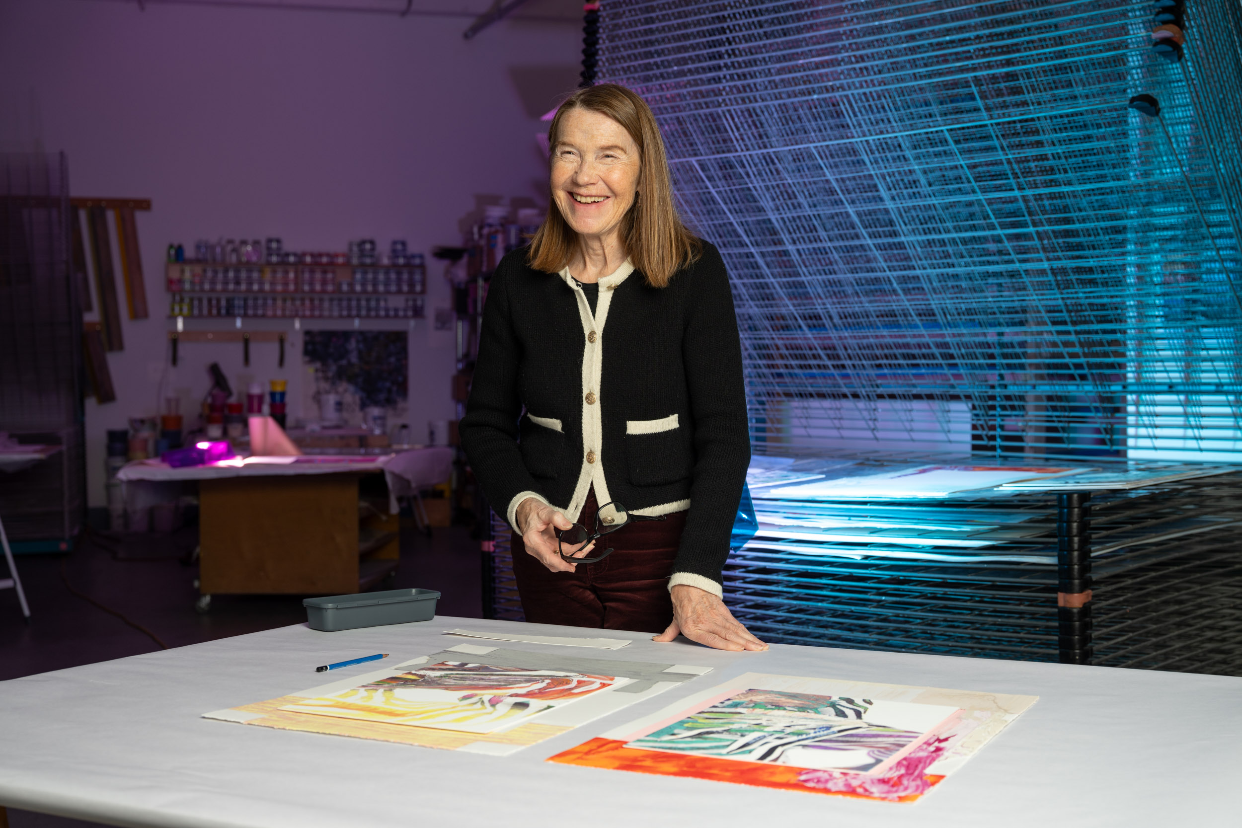
Keigo, the printer, translated these robust, visceral passages of color and the finely chiseled, painterly gradients into a varied web and blend of printing inks. With the utmost care, he printed countless individually exposed screens one after another, layer over layer, nuance by nuance. This creates the impression of a tactile color relief.
What is the meaning behind the title Tabor?
In Hebrew, Tabor means mountain, a topographic elevation. A climb asks a great deal of the walker, and the mountain path rewards them with long views over wide, unknown terrain.
Interested in adding a Pia Fries edition to your collection? Tabor A and Tabor B are available, exclusively on Haystack. Click here to learn more about Pia Fries.